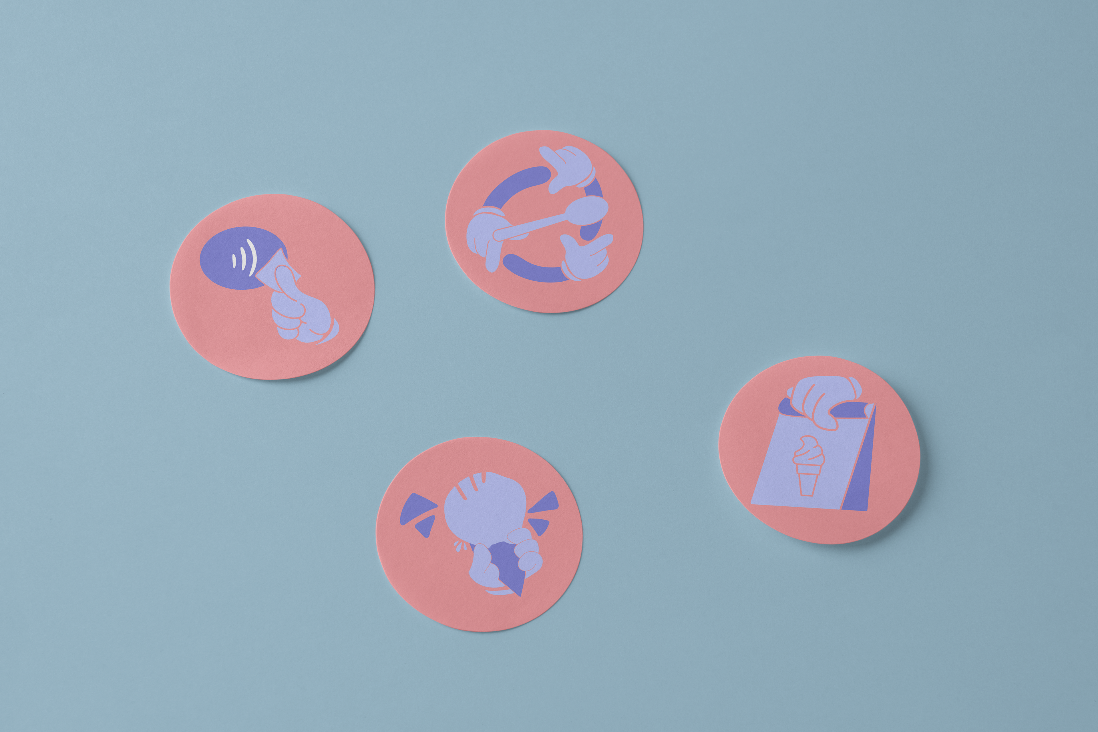
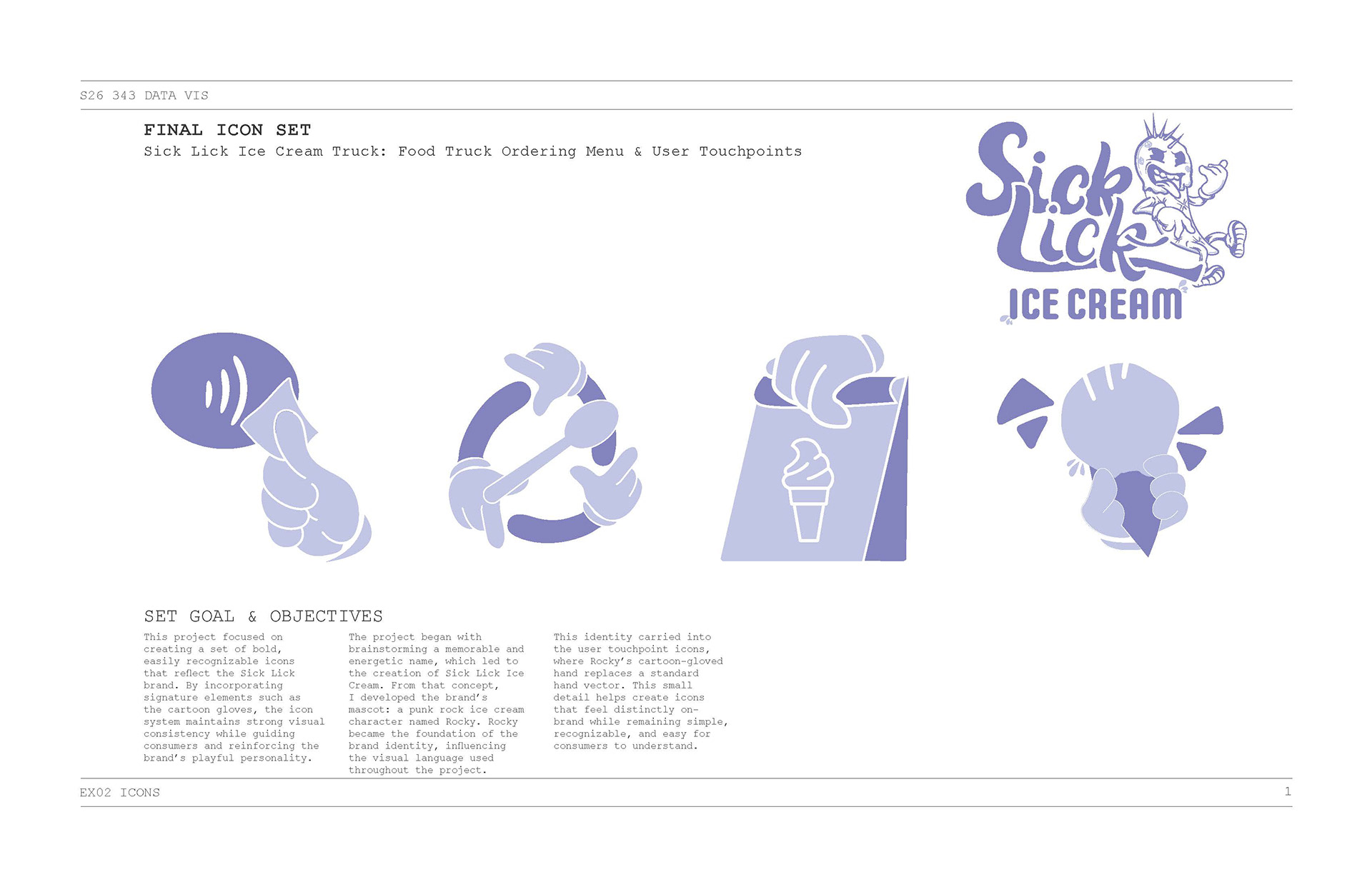
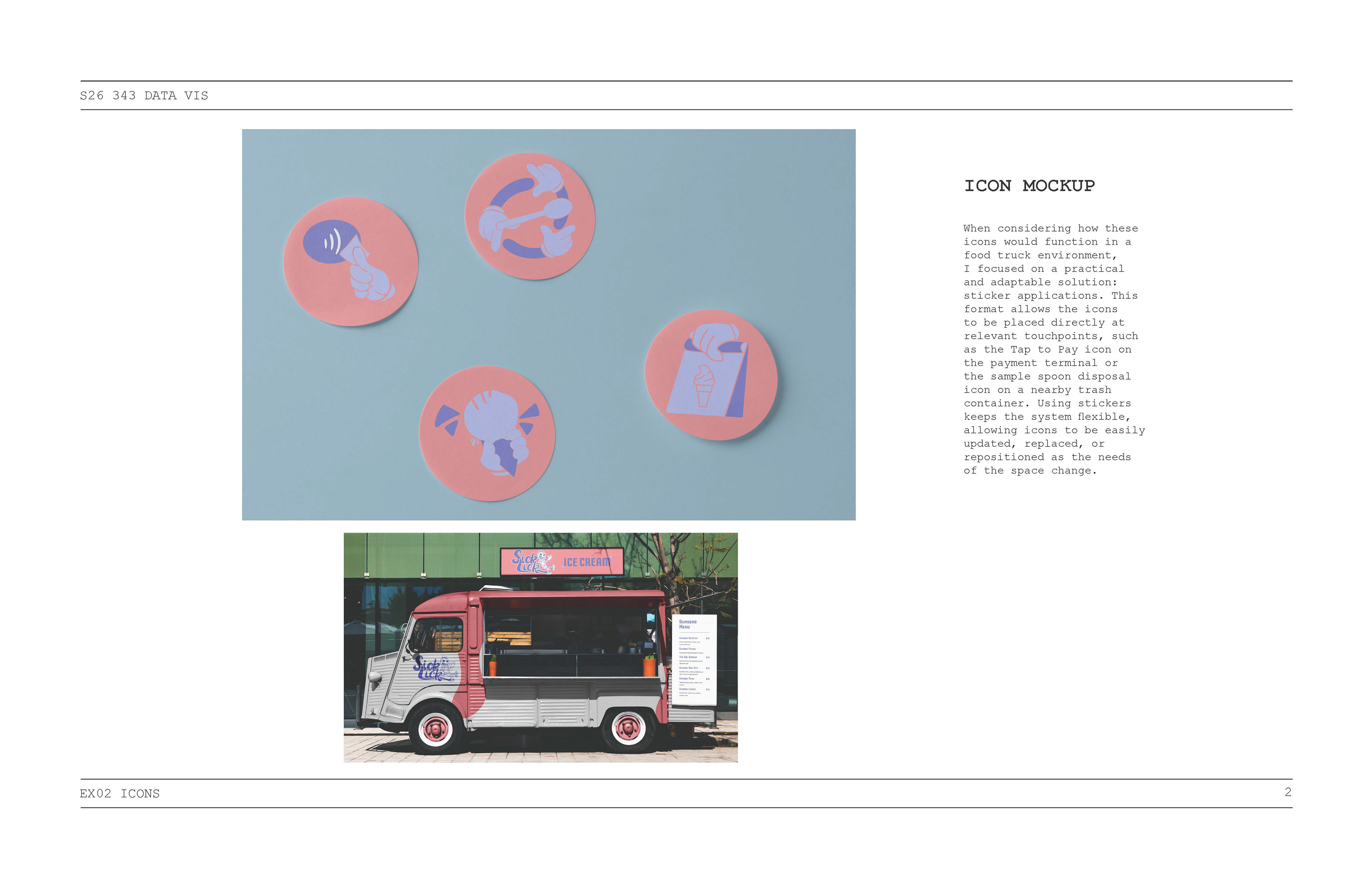
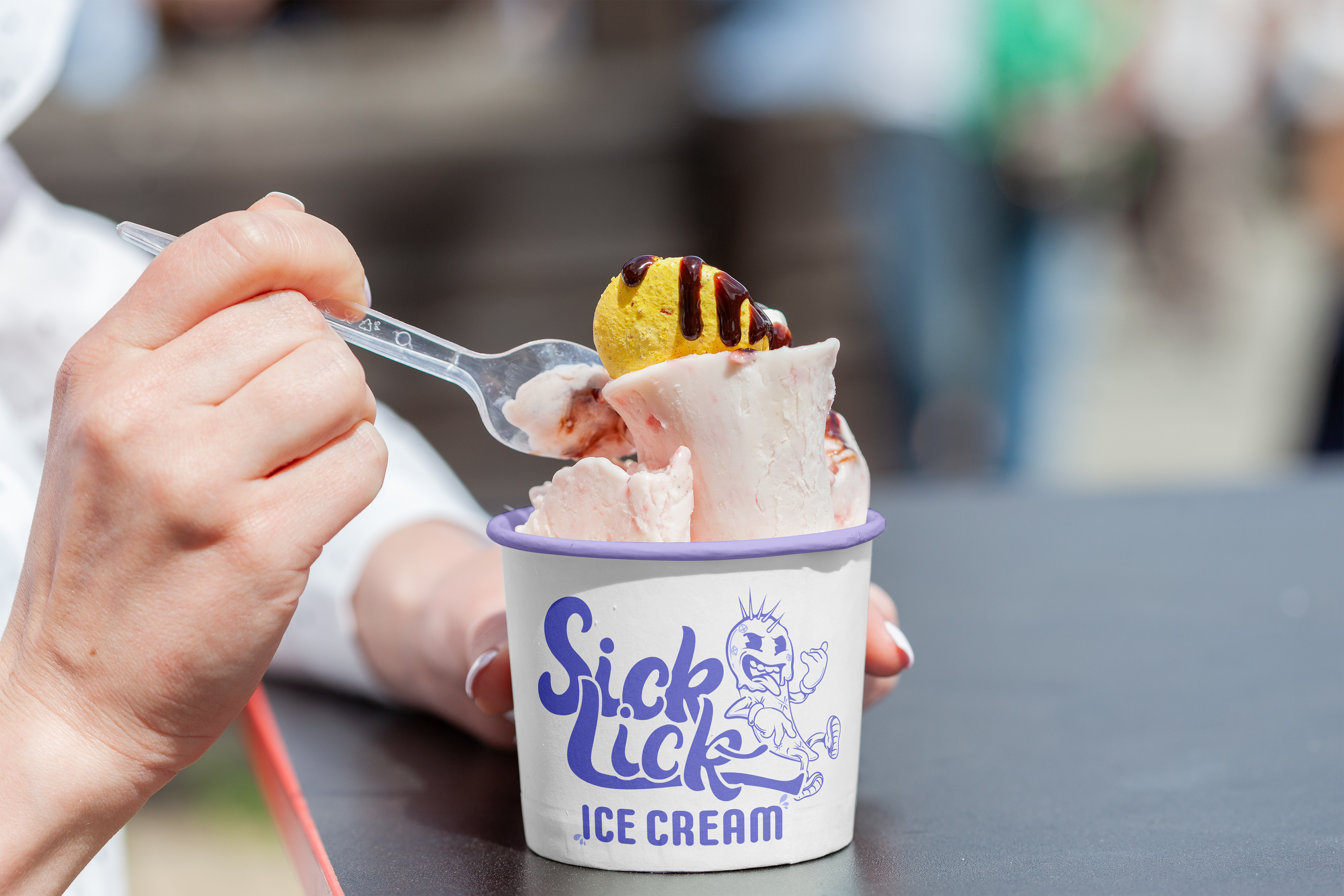
This project focused on creating a set of bold, easily recognizable icons that reflect the Sick Lick brand. By incorporating signature elements such as the cartoon gloves, the icon system maintains strong visual consistency while guiding consumers and reinforcing the brand’s playful personality. The project began with brainstorming a memorable and energetic name, which led to the creation of Sick Lick Ice Cream. From that concept, I developed the brand’s mascot: a punk rock ice cream character named Rocky. Rocky became the foundation of the brand identity, influencing the visual language used throughout the project. This identity carried into the user touchpoint icons, where Rocky’s cartoon-gloved hand replaces a standard hand vector. This small detail helps create icons that feel distinctly onbrand while remaining simple, recognizable, and easy for consumers to understand.